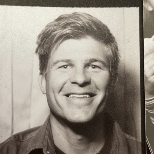
This is Joe

This is also Joe
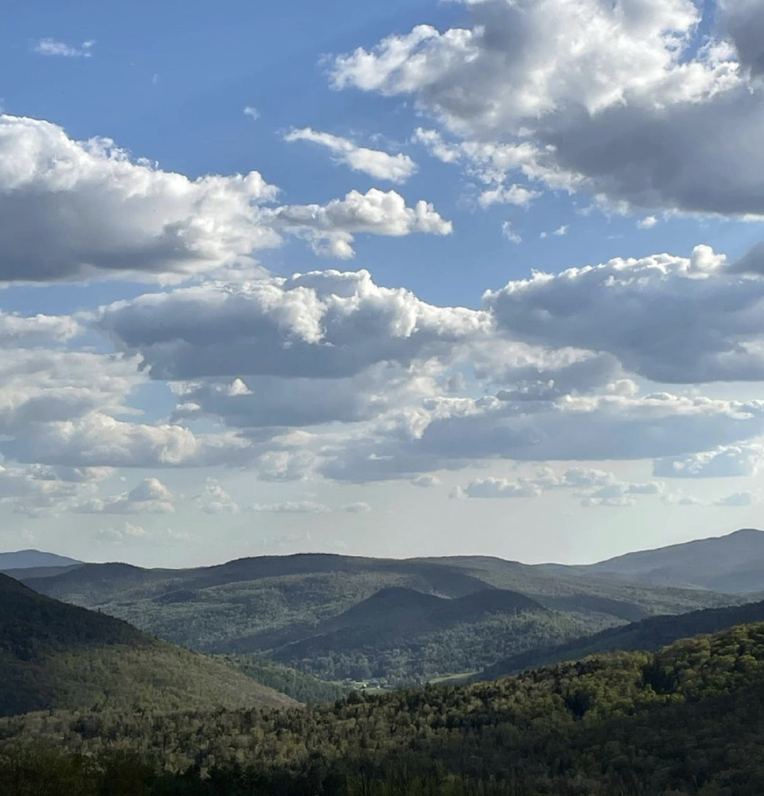
It's a homeschool family, which means taking extra time for incubating curiosity and for joy-rides
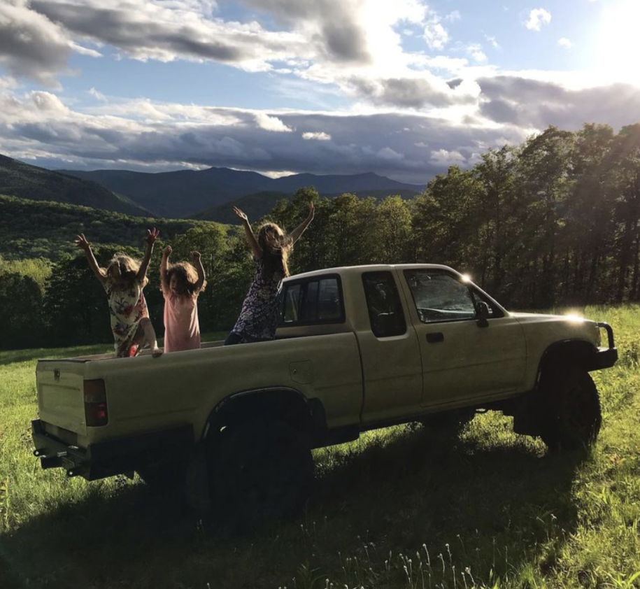
Practicing curiosity is a lifelong gateway skill with no upper-bound

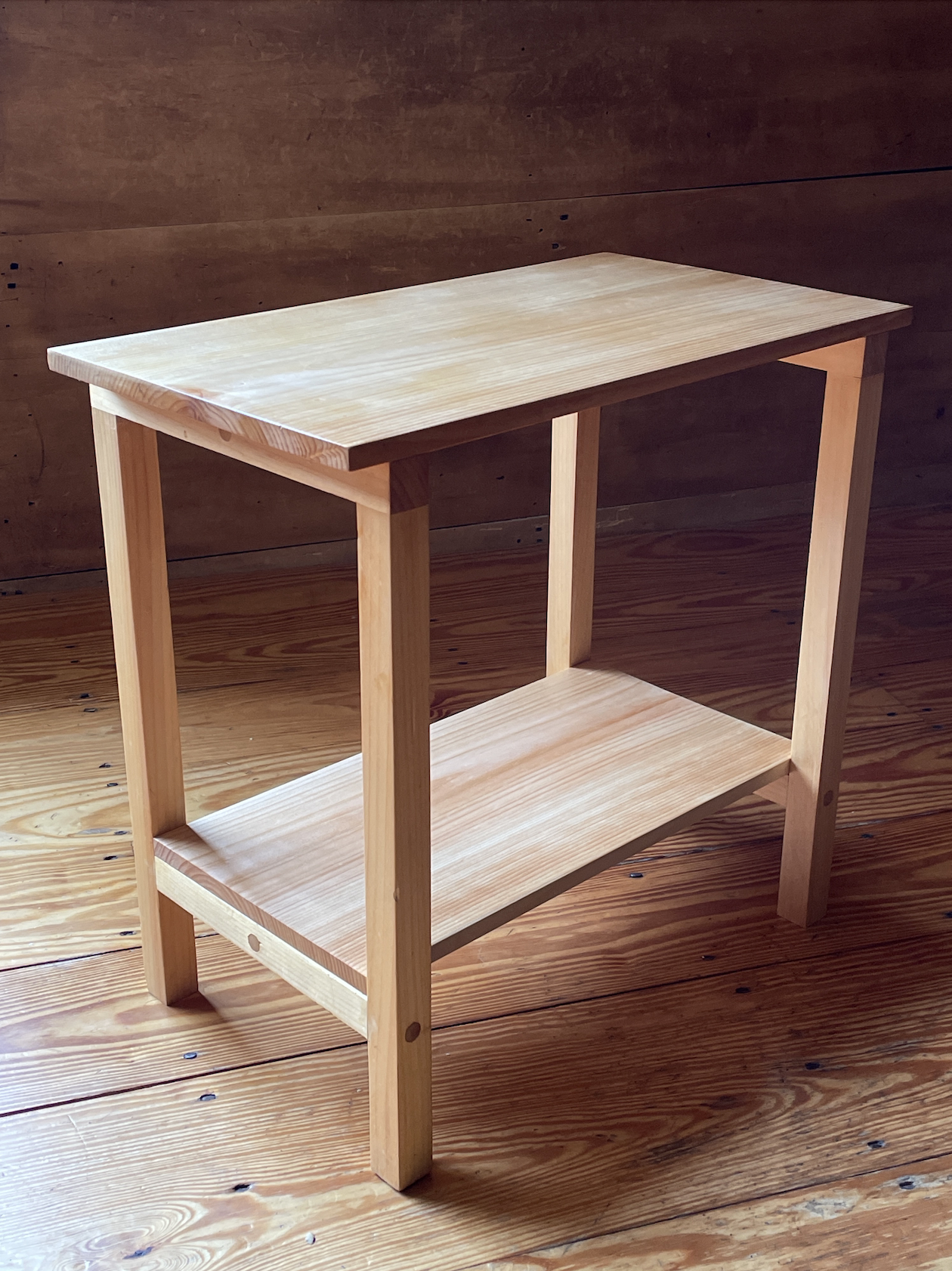
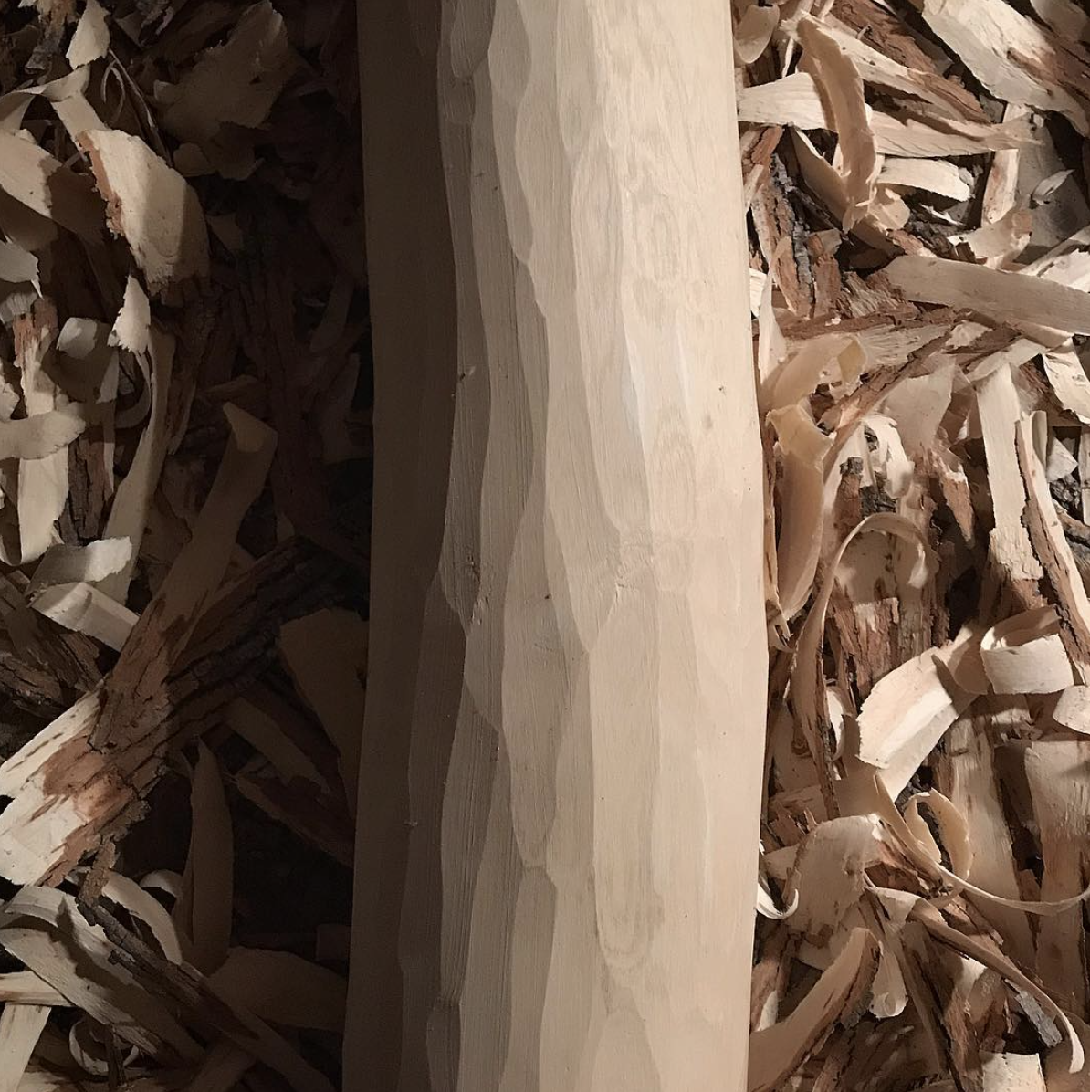
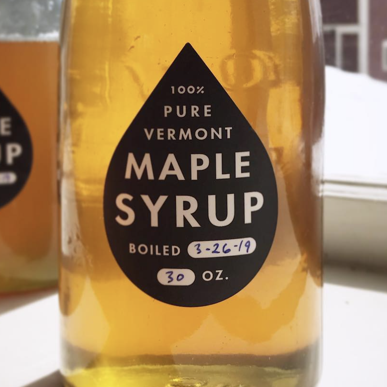
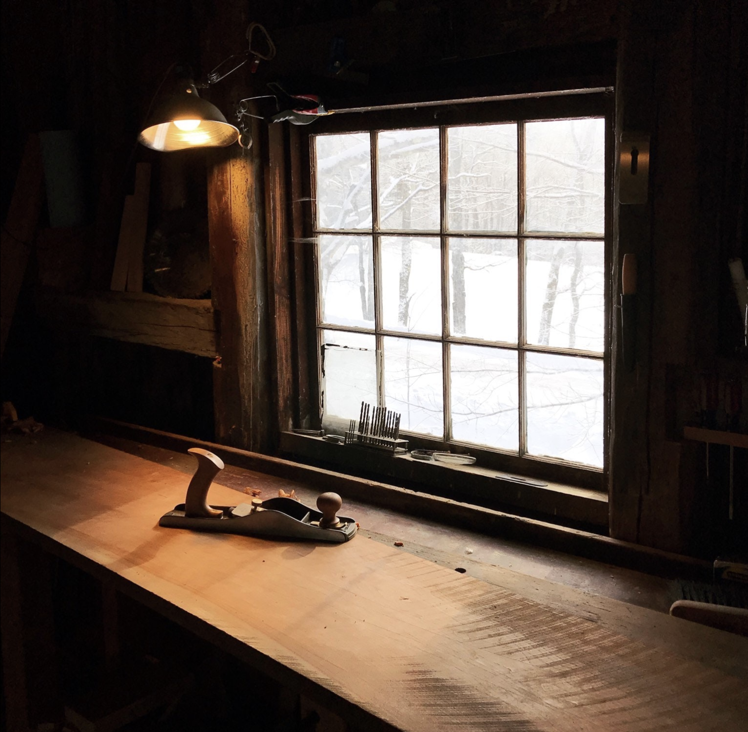
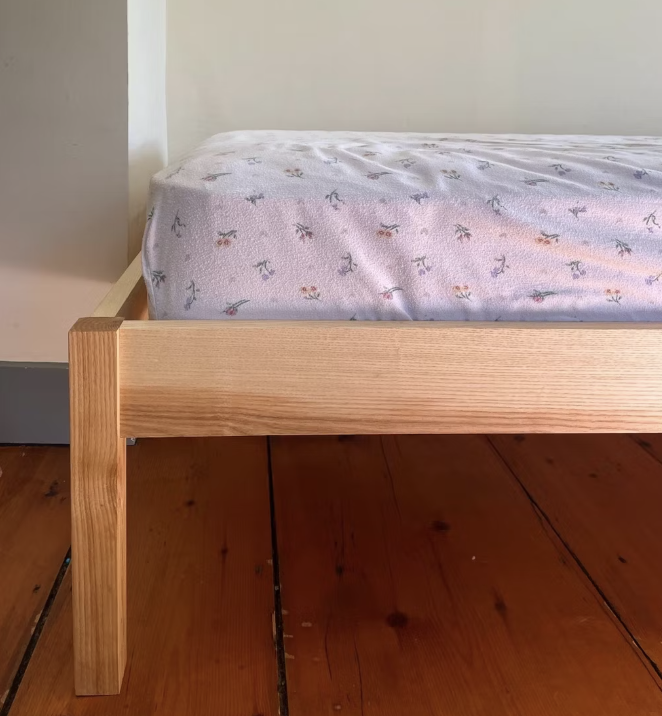
Joe's hobbies revolve around trees: planting them, cutting them down, making things out of wood
Here's a
microsite ↗
of carpentry projects. Woodworking is constructive — slow handcrafts build
embodied knowledge
and creative instincts


Joe has created a number of NFT projects that use onchain SVG, which you can see in this
gallery ↗

Crypto is important for humanity because economic freedom and access to financial tools are human rights.
If you're curious about that, get in touch and say hi. You can find Joe online on
twitter ↗,
farcaster ↗, or
linkedin ↗
. Or check out his portfolio ☺