
Trade is a digital commodity exchange in West Africa that connects farmers to buyers, cuts out the physical marketplace, and creates a more accessible, efficient, equitable market. Buyers and sellers use the app or SMS to create orders with their best offers, and the platform matches profitable pairs.
Mobile devices are transforming emerging markets, but with the opportunity comes unique constraints — many farmers in Ghana read limited English and are working with unfamiliar, low-resolution devices. To lean into that limitation, I designed an order system that relies on straightforward questions, bold graphics, and a simplified equation to represent each offer.
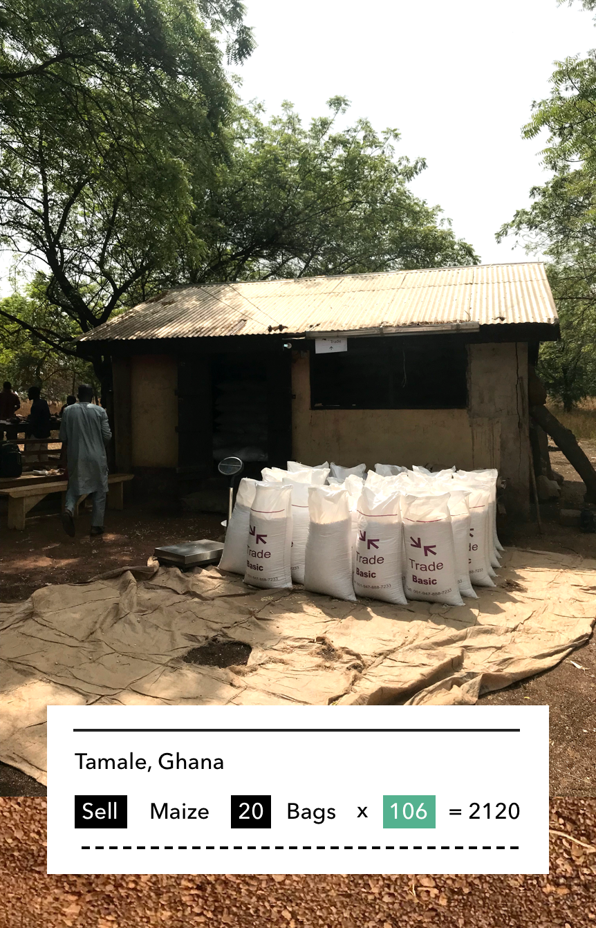
In this example of an actual order in Tamale, Ghana, the complex details of taxes, fees, and transportation costs are minimized and the user can see at a glance that 20 bags of maize are for sale for 2120 Cedi, the local currency. This is particularly helpful for farmers who create and manage dozens of open offers and in-process transactions.
The creation process is spread over many steps, so that each stage can be completed with an explicit action. This makes the creation flow predictable and allows for big, bold buttons. It also creates a conversational UI flow that can be completed entirely via text message, which was initially used as a minimum-viable version of the service and remains a useful fallback.
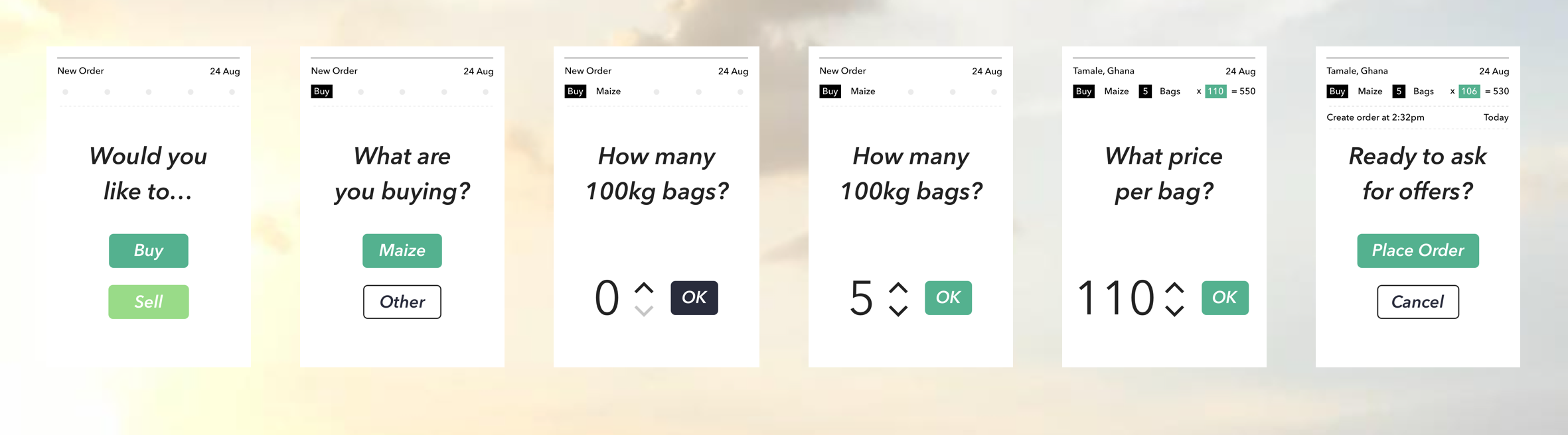
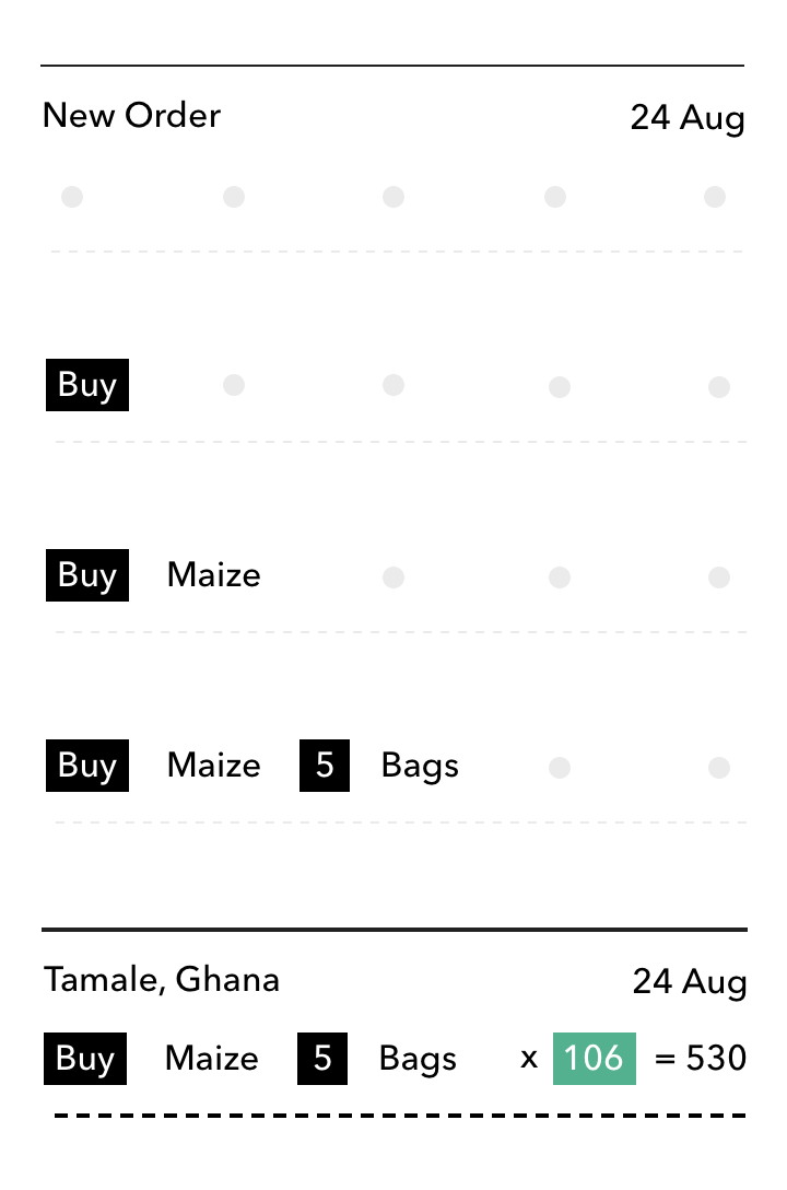
As a user creates an order, the questions populate an order "card", step by step. By seeing each element in the card appear, the user builds an understanding of its composition so that later on the abstracted elements are easier to read and understand.
This order card is the primary object or building block of the entire app. It persists across the various views, and almost all the information presented in the app is formatted to fit this model. This helps with user onboarding, which begins with a training session. Beyond that, in-person support is limited, so it's helpful that new views like pending offers that may not exist during the first session are easy to interpret later on.
The visual style of the UI reflects the functionally minimal langauge of the order creation flow. Plenty of whitespace helps with legibility, and the bold color palette makes for a simple, direct tone that is easy to read at low-resolution.
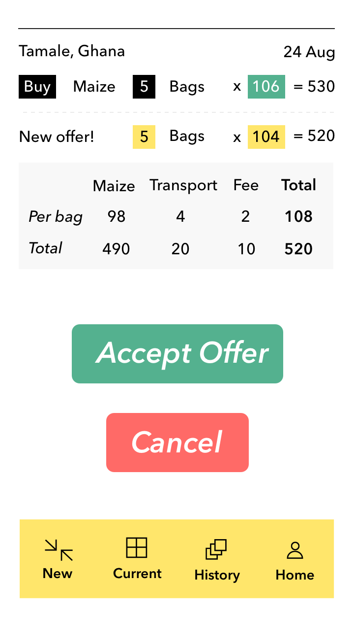
This example shows the expanded card details of an outstanding "Buy" order that has a pending offer. In this case, the algorithm has paired an offer to sell at slightly lower price that our first user was willing to pay!
By cutting out the real-world costs of physically bringing bags to a marketplace, relying on a chance encounter, and negotiating with strangers, Trade is able to facilitate a more efficient marketplace.
And that's what is so exciting about new technology. The new opportunities it creates don't come at the expense of anything but old habits and inefficiencies. Lowering barriers to enter and transact make the market better, more accessible, and more profitable for everyone.